7 Characteristics of a Good Logo
As I've already mentioned, a brand and a logo are not the same thing. However, the logo is a fundamental part of a brand's visual identity. That's why today I'm sharing seven general principles that a good logo should follow.
It doesn't matter whether you hire a designer to create your logo, do it yourself, or use a pre-designed one you buy online… it all comes down to the same thing. These principles will help you better assess whether the work you're having someone else do—or the work you're doing yourself—is on the right track.
But before we get into the details, there’s something I want to make clear: although these are generally applicable principles, nothing is set in stone… the best logo isn’t the one designed according to rigid principles or formulas, but rather the one created with the specific characteristics and circumstances of each case in mind.
That said, let's take a look at the principles that the best logos should follow (and generally do follow).
Characteristics of a good logo
1. Simplicity
A logo is a visual representation of something abstract (a brand). A logo is not an image that should describe every aspect of your business, nor is it a detailed illustration of everything you do, nor should it literally represent all the concepts behind that brand.

The FedEx logo is one of the classic examples of good design, and for good reason. The color scheme conveys dynamism and catches the eye; the typography is modern, corporate, and trustworthy; and the arrow hidden between the "E" and the "x" adds an element of surprise while conveying movement and precision.
Anything that hinders the communication of a message creates noise and interference… and if a logo—which is such a concentrated form of design—contains too much information to process and interpret, it will create noise. In logo design (and in design in general), most of the time, less is more.
On the other hand, simple logos—free of unnecessary embellishments and without looking like they came straight out of the Baroque era—are easier to remember, and this, as you’ll see later, is essential for a good logo.
And keep in mind that when I talk about overcomplicating a logo, I’m not just referring to the illustrations or shapes that go with it. I also mean that the text in the logo shouldn’t be overloaded, that it shouldn’t have every color of the rainbow plus a few others we might come up with along the way, that we should avoid color gradients (I love gradients, but they often don’t look good in a logo, so you have to be careful with this), and that we shouldn’t combine fonts that don’t go well together.

The World Wide Fund logo is very simple, even though it includes an image: notice that it consists solely of black areas that, in turn, form the white areas.
2. Representativeness
This feature might seem to contradict what I just said about the simplicity of a good logo, but let me explain what I mean.

The Twinnings logo features a serif font that conveys the brand's classic spirit.
A logo should encapsulate a brand—not necessarily what it does, but its essence, its personality. Otherwise, tell me what a bitten apple has to do with technology, or a mermaid with coffee… nothing. Instead, they do have to do with the experience and personality of those brands.
That’s what I mean when I say a good logo should be representative… it should stay true to the personality and identity of the brand it represents. A logo that doesn’t capture a brand’s essence is associating it with something else… and that shouldn’t happen!
That is why so much thought and care must go into designing a good logo, and it should not be chosen based on whims or personal preferences that have little (or nothing) to do with the brand's essence.

The Starbucks mermaid is the company’s primary visual identifier and is closely tied to its history and essence: the name “Starbucks” comes from the novel *Moby Dick*, the company originated in a port city (Seattle), and coffee travels long distances by sea to reach its destination. You can read more about the history of the mermaid here.
3. Scalability
This characteristic is also closely linked to simplicity, as a logo must be scalable to different sizes: from the size of a sign at a store entrance to a tiny version that fits on a business card or a flash drive given as a corporate gift.
And it shouldn't lose its readability at those small sizes. When printed on a small scale, it shouldn't be a barely legible smudge—no… it should be clearly visible and recognizable even in miniature format.
And this is something that overly ornate logos—with thousands of embellishments or poor-quality calligraphic fonts (so trendy these days)—simply can't achieve.
That said, this doesn’t mean you can’t design logos using calligraphic typefaces—far from it (I used them myself in this rebranding projectI did). But you have to choose your typefaces very carefully (or design them very well if they’re custom-made) and take into account how the logo will look and read at different sizes. Sometimes it’s also necessary to design variations of that logo for use at different sizes.
Going back to the example of Apple… Do you know why the designer of the Apple logo made it with a bite taken out of it? As he explains, the bite “is there for reasons of scale, so that when the logo is small, it’s still recognizable as an apple and not a cherry.”

Johnson's uses a calligraphic typeface for its logo, and it works perfectly even at small sizes.

The fruit of desire, but also a design choice justified by practical considerations.
4. Pregnancy
Memorability is simply the ability of a visual design to capture attention and be remembered. It’s a concept widely used in the design field, but what it means is that a good logo must be memorable. It must leave a lasting impression on the viewer and be easy to recall.
And this, my dear, is hard to achieve with an overly busy logo, because there are too many elements to take in and remember later. Once again, simplicity is key to a good logo.
Of course, this memorable impression isn't achieved solely through simplicity in design, but also through ingenuity, wit, humor, or a nod to the brand's audience.

A logo that’s impossible to forget thanks to its blend of simplicity and ingenuity, and one that masterfully captures what it’s all about: food writers.
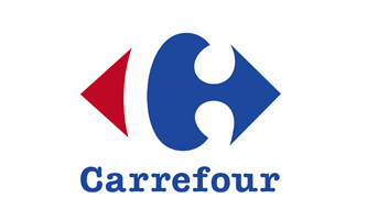
Eye-catching, representative of its country of origin (France) and of what it means (carrefour means “intersection”), and also hard to forget.
5. Originality
Oh… that much-discussed concept of originality. In a world where everything (or almost everything) has already been invented, it’s really very difficult to create something that’s completely unique. However, when I talk about originality in logo design, I mean that it should be different and distinctive within its industry.
If you run a photography business and your logo features a camera, you won't stand out much. Or if you're a wedding photographer and instead of a camera you have a bouquet of flowers… same thing. Just look around and you'll see that these logos are a dime a dozen in the photography industry.
And this is actually an advantage. Why? Because it will be very easy for you to stand out from any other visual solution you come across.

For a catering company, this design solution (and its variations) is eye-catching and unique, while also conveying a sense of freshness—which is so important when it comes to food.
6. Durability
If you have to change your logo every three or five years because it looks “dated,” you have a problem. Not only because redesigning it will cost you time and money, but also because you’ll confuse your audience.
But that’s what happens when you make certain design decisions for a logo based not on its function, but simply because it’s “trendy.” You should keep trends in mind and use them to your advantage whenever appropriate, but don’t overdo it. A logo should remain relevant even after the latest trend has passed.
Logo design should be based on sound reasoning... perhaps the version that works best or is most impactful isn't the one you like the most, but you have to learn to be critical and make decisions rationally—not just based on personal taste or, worse, because you've grown tired of the one you have. And mind you, I’m not saying you can’t like your logo! What I mean is that you have to find a balance between personal taste, trends, and rationality.

How long have you been seeing the same Coca-Cola logo? Exactly.

Simple, powerful, memorable, and timeless, the Nivea logo has been around with hardly any changes since the middle of the last century.
7. Relevance
If your brand design should be created with your audience in mind, why should your logo design be any different? It’s essential to know who you’re targeting so you can design a logo that effectively represents your brand and helps people identify with it.
It’s also important to be familiar with the industry’s codes and conventions, so you don’t end up designing a logo for a bakery that looks like it belongs to an insurance company.
On the other hand, when designing a logo, you need to consider where it will be used most of the time, or in which format it is most important. For example, some time ago, the Johnnie Walker logo was redesigned to give it a simpler, more modern look... at first it seemed fine, but the problem was that this decision didn’t take into account the audience or the values associated with the brand, nor the fact that a slightly more elaborate design actually looked much better on the bottle labels... The result? A redesign shortly thereafter, returning to the brand’s original image, though with extraordinary illustration work that combined detail with simplicity (using only black areas to create white shapes).

Aimed at a rock audience, the Rolling Stones logo exudes power, irreverence, and provocation.

Johnnie Walker's new visual identity revives the brand's classic, elegant, and dandyish spirit.
In summary
Although logo design isn't an exact science and each individual case must always be considered on its own merits, there are several factors to keep in mind. This doesn't mean that a good logo must necessarily have all seven of the characteristics I just mentioned, but it's helpful to keep them in mind to achieve the best possible result.


![How to Sell Online Courses with Squarespace [Updated for 2024]](https://images.squarespace-cdn.com/content/v1/6788d438405dc03eabea6c99/1737020477911-65DRZUM6E66MDXLHVRT9/cursos-Squarespace.jpg)


