The best template for Squarespace 7.0 in Spanish
This article applies only to Squarespace templates released before July 2020.
If you're just starting to look for general information about Squarespace templates, check out the post "How to Choose a Template for Your Squarespace Website" first , where I explain the differences between the two versions of Squarespace and their templates.

One of the most confusing aspects of Squarespace is that it uses templates. And to be completely honest, the way Squarespace uses templates can be a bit confusing for a user who is just starting to use the platform: on the one hand, there are dozens of different templates; on the other, there are also template families… and to top it all off, there are templates that belong to the same family but look completely different. Fortunately, this has been fixed in the platform’s latest update.
Now, if you’ve been using Squarespace since before July 2020, or if you want to use a template from an older version of Squarespace (you can see when this might be useful in the post I linked above), you only have a few template families available:
This might seem a little limiting at first, but the good news is that Brine is considered by many to be the best Squarespace template. So in this post, I’m going to explain why Brine is the best, and everything you can do with it on Squarespace.
First, how does the Brine template work?
It’s important to note that within Squarespace, “Brine” is both the name of a template and a family of templates: this means that all the templates in that family share the same features, even though the design Squarespace shows you for each template may look completely different.
For example, below are two screenshots showing what the Moksha, Brine, and Clay templates look like (click on each one to see the full page layout):

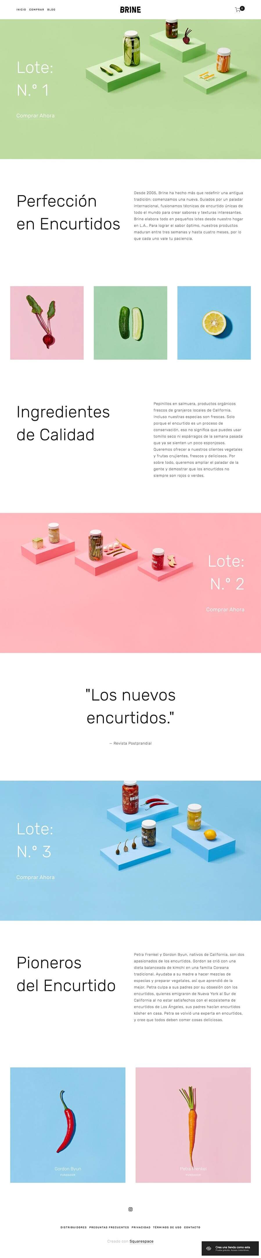

As you can see, they look very different, but all three belong to the Brine family; in other words, each template has a different style, but at their core they share exactly the same features and capabilities.
More than just a template, the Brine family functions as a framework—a basic structure within which many elements can be adjusted and customized to meet the page's specific needs in terms of functionality and design.
The templates that make up this family are:
Brine (which was the first to be designed, and that’s why all the other variants are part of the family of the same name), Aria, Basil, Blend, Burke, Cacao, Clay, Ethan, Fairfield, Feed, Foster, Greenwich, Hatch, Heights, Hunter, Hyde, Impact, Jaunt, Juke, Keene, Kin, Maple, Margot, Marta, Mentor, Mercer, Miller, Mojave, Moksha, Motto, Nueva, Pedro, Polaris, Rally, Rover, Royce, Sofia, Sonny, Sonora, Stella, Thorne, Vow, Wav, West.
To give you an idea of what the different templates look like, below is a carousel of images showing the homepage headers of a few of them, along with a link to each one's demo page:


Why is Brine the best template?
You could actually choose any other template to build your site, but since Brine is considered the best and also comes with Spanish language support built in, there’s no question in my mind: go with Brine or any of the templates in its family. Furthermore, Brine has a number of advantages over other templates:
It's a modern and highly flexible template
Brine is one of the most modern templates developed by Squarespace, and one that is constantly being improved and updated; it’s no coincidence that Brine is the family with the largest number of available templates.
One of the features that makes this template so powerful is its great flexibility. There are many aspects of the template's design that can be customized in the style editor, and it also includes a wide variety of page types with different functions and features.
In general, you can create many different designs for a wide variety of websites using this template’s framework. Depending on how you configure it, you can tailor it for content-focused sites, portfolios, service-oriented sites, or online stores, making it a great fit for various websites with different needs, goals, and functions.
It also features two menus (a primary and a secondary one) that work very well for sites with a lot of content, or with sections and subsections that need to be organized. This feature (the inclusion of two menus) is what makes it possible, within this family of templates, to configure a website with just a little code and turn it into a bilingual site, as I did with this client’s site.
It includes many options in the style editor
The Style Editor is a section within the Squarespace admin panel (you’ll find it under “Page Styles” in the Design section) that lets you customize countless aspects of your template’s design with just a few clicks. If you’re not quite sure what I’m talking about and want to take a look inside Squarespace to see how it works and all the things you can change, you can watch one of the videos from my introductory course on Squarespace, or check out a post I wrote explaining 12 things you can customize in your Squarespace template without using code.
That said, the number of options you can customize in page styles isn’t always the same and varies from template to template. With Brine, you can change a wide variety of design elements within the style editor, so if you’re in DIY mode with your website, this will make your life much easier when it comes to tweaking your website’s design.
Features of Brine
Those are the main advantages of Brine, but now let's take a closer look at the specific features this template offers.
One of Brine’s most notable features is that it does not include a built-in sidebar for the blog. These days, sidebars on websites have many critics due to concerns about clean, minimalist design, and also because on mobile devices—which account for the majority of current web traffic—they do not serve their original purpose. However, there are times when they are appropriate and can work well if designed carefully.
So if you're thinking about adding a sidebar to your website, it's important to keep this limitation of Brine in mind, because in that case you'll have to either create one yourself or purchase a code snippet (similar to a plugin) that allows you to add a sidebar to your site. Neither of these options is particularly complicated or expensive, but it's good to know this in advance.
Now, the main features shared by all the models in the Brine family are:
Image banners on web pages (other images, text, forms, or any other type of element can be overlaid on top of them).
Creating pages with full-width backgrounds.
Parallax effect in images.
Blog in list view orgrid view, with or without post cover images.
Two top-level menus (primary and secondary).
Search bar and social media icons in the top menu.
Fixed navigation bar (sticky menu).
Center or left alignment of the menu.
For online stores:
Breadcrumb navigation.
View products in list or carousel mode.
Product details with image zoom.
Footer with three content areas.
You can find all the information about the Brine family of templates here.
How to Choose the Best Brine Family Template for Your Website
Ideally, you should design a website from scratch, tailored to the needs of the business that will be using it (which, by the way, you can easily do with Squarespace). However, not everyone can afford to hire a designer right from the start of their business, and in most cases, you have to take a DIY approach to at least get a website up and running.
Now then… You already know you want to build your website on Squarespace, and you already know you’re going to use a template from the Brine family—but how do you know which one to choose from all the templates in this family?
As we've seen, all the templates in the Brine family include exactly the same features, so I recommend that you follow these steps:
Start by figuring out how you want the content on your website to be organized, so you can then choose a design that helps you achieve your goals for the site. I have a post where I discuss the user journey visitors should take on your website, which might help you think this through.
Once you’ve decided which elements to include in your website design, review the different templates in the collection and choose the one whose design most closely matches the final look you’re aiming for. For now, don’t worry about things like colors or fonts, since you can easily change those in the style editor. Instead, focus on the site’s structural design, such as:
If you need the logo to be centered on one side,
whether or not your site needs to include a pre-footer,
if you need a primary menu and a secondary menu because you have too much content,
or whether you want the blog page to be formatted as a grid or a list.
If you can't find a single template that includes all the design features you're looking for, don't worry: you can customize all of this in the style editor as well. You're just looking for a good starting point here so you can begin building your site at with many of these aspects already set up, because that will save you a lot of time.


![How to Sell Online Courses with Squarespace [Updated for 2024]](https://images.squarespace-cdn.com/content/v1/6788d438405dc03eabea6c99/1737020477911-65DRZUM6E66MDXLHVRT9/cursos-Squarespace.jpg)

