Workflow: Web design on Squarespace for Dani Arjones, a wedding photographer in Valencia
Dani Arjones is a wedding photographer in Valencia who first contacted me several months ago (in 2018) to request some minor adjustments to his website. Since his site was built on Squarespace, he needed someone who specialized in that platform.
This initial contact was about making some changes to his website design, which actually turned out to be adjustments to the site’s settings, so he hired me for a Squarespace customization service. It was a small job, but it gave him a chance to see how I work and my ability to handle Squarespace. Months later, when he was ready to make the investment, he contacted me again to do a complete website redesign, and in this post I want to share what the workflow was like on this project.
First things first: identify the website's problems and objectives
The first thing I always do on any project—whether it’s branding or web design—is ask the client to fill out a questionnaire (I have different questions prepared depending on the type of project) to better understand the history and values of their business, as well as the main challenges the project aims to address (such as a new brand identity or website design).
In a web design project, it’s crucial to understand from the outset what issues the client is facing with their current website (and their business), and what goals they hope to achieve with their new site. This is essential because it’s what will enable us to create a strategic web design and build a site that truly helps meet those goals and boosts the business. It’s not much use having a very attractive website if it doesn’t help your business run smoothly or drive it forward.
Issues and Objectives
As I mentioned, Dani is primarily a wedding photographer, and in a market as saturated as this one, one of his challenges was that his old website—and, by extension, his photographs—got lost among all the other wedding photographers’ sites. Therefore, with his new website, one of the goals was to stand out from the competition and showcase his photos more effectively. To achieve this, it was important to study other wedding photographers in Valencia, their websites, and how they present themselves to potential clients, so that we could use this information to create an image that would set Dani apart from the rest.
Another issue we identified with the old website was that Dani, the photographer behind the photos, was practically invisible. This was a problem because when choosing a wedding photographer, you need to feel a certain personal connection with them—beyond just liking their style and photos. Ultimately, there are other wedding photographers who are just as professional and have attractive portfolios, and what can make the difference is how much brides-to-be identify with one photographer or another, since Dani wasn’t interested in competing on price.
With this in mind, it was important to showcase the photographer behind the business— both in person and through his story—to help build a stronger connection and trust with potential clients, which is vital when it comes to a service as personal as wedding photography, especially given that the prices involved require a significant level of trust to make the investment.
In summary, the main goals for Dani's website were:
Showcase the photographer and their work more effectively.
Make it very easy for potential customers to get in touch.
Make it easier for visitors to navigate between the website's galleries, so they spend more time on the site looking at the photos and getting to know Dani.
A note about the copy
At this point, I’d like to pause the design process to mention something very important: the copy. A website tells a brand’s story through images and words.
It’s very difficult to design a website that works well if the copy isn’t well-structured, or if there isn’t a narrative to support the visual story. This combination of text and images is what guides visitors through the different sections of each page—and the website as a whole—until they take the action we want them to. Together with the images, it’s also essential for creating an emotional connection with visitors.
In Dani’s case, the initial copy had several issues, so I recommended Laura from Once Upon a Copy, who worked on the text for several pages of the website. This meant we had to put the design work on hold until the copy was ready, and although it was well worth it, it caused an unavoidable delay. Therefore, I recommend that if you’re thinking about creating a website, you have the text ready before starting the design work, so there are no delays along the way.
The website design process
Defining the visual style

Dani Arjones' logo, which had already been designed previously.
Now that the website’s objectives are clearly defined, it’s time to move on to the design itself. In Dani’s case, he already had a logo, but no fully developed visual identity: he hadn’t defined brand colors, typefaces, supporting graphic elements, or anything at all beyond a standalone logo and his personal style as a photographer. This is one of the most common mistakes I see when it comes to identity design, and it’s very important to clarify: branding (or visual identity) and a logo are not the same thing, as I’ve explained on other occasions.
So, since we didn't have a brand identityto guide the web design,we had to start by creating a visual identity that was consistent with Dani's brand and with the logo he had already designed.
The first step was to create the mood board. I usually use images from Pinterest to create mood boards for my clients, but in this case, since the client was a photographer, I used his own photographs in the process.

So , based on her own images, certain themes emerged, such as natural elements (floral and marine), and colors: a dark blue with a slight green tint , like the one seen in the mountains and the river water in one of the photos (Dani wanted to emphasize the connection between nature and outdoor weddings), a desaturated blue as a secondary color, several lighter colors, also in very organic and natural tones for backgrounds, and a khaki-orange for accent elements and to add a bit of warmth to the palette.
The additional graphic elements featuring floral motifs (to reinforce the connection to the wedding industry and her core audience: brides) and nautical motifs (to highlight her personal story, which was already reflected in the logo and had a strong connection to the sea) needed to have a style similar to that of the logo, to maintain visual consistency. For these elements, I turned to Creative Market*, one of my favorite places to find graphics and fonts, and suggested these graphics:
Powered by Creative Market
Powered by Creative Market
In addition to the mood board, I had to choose the fonts for the website. I settled on Cormorant Garamond as the primary font—a very elegant, classic typeface with smooth curves in its italic version—which created a sense of consistency with the lettering of Dani’s main logo. This font, in its italic version and in various sizes, colors, and weights, would serve as the primary typeface.

Cormorand Garamond in the various sizes, weights, and colors used on the website.
For the text blocks and buttons, I chose Roboto, a font I love because it looks great on different screens and contrasts well with more classic fonts like Cormorant Garamond.
Prototype design and implementation on Squarespace
Once we’ve established the overall look and feel of the design, it’s time to create the page mockups. The package Dani had signed up for included 4 pages plus a blog and a post, but we added more pages to the project as we went along.
Taking into account the goals we had initially set for the website, I created a design that met the following criteria:
That it would feature Dani's photograph prominently, as well as highlight the photographer behind the work.
It should be very easy to contact Dani with just one click, from any page.
Make it easy to navigate from one gallery to another on the site using calls to action and eye-catching links.
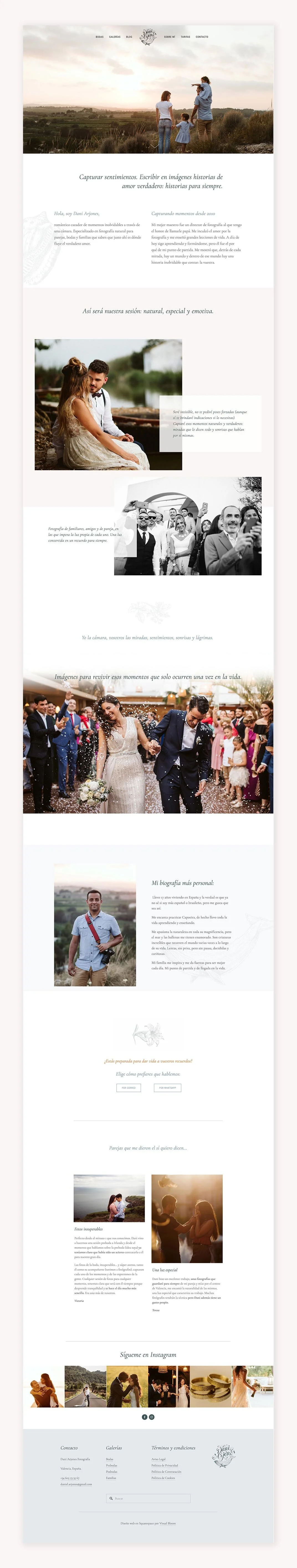
This is why we opted for full-width headers with no text overlay, designed to function as a portfolio within the website itself. From the homepage, visitors are invited to explore the galleries Dani wanted to highlight; a photo of Dani is displayed along with an introduction to who he is and his story; and a contact section is included, with the option to send an email (a form opens when clicked) or send a message via WhatsApp.
This structure was maintained across all the gallery pages on the website, where photos are prominently displayed, accompanied by text describing Dani and his approach to his work, links to other galleries, and a call to action leading to the contact section. In the site’s footer , in addition to displaying Dani’s Instagram gallery, we included all the necessary contact information and links to all the gallery pages. Floral and marine graphic elements were incorporated as backgrounds and vignettes, giving the design a delicate and elegant style.
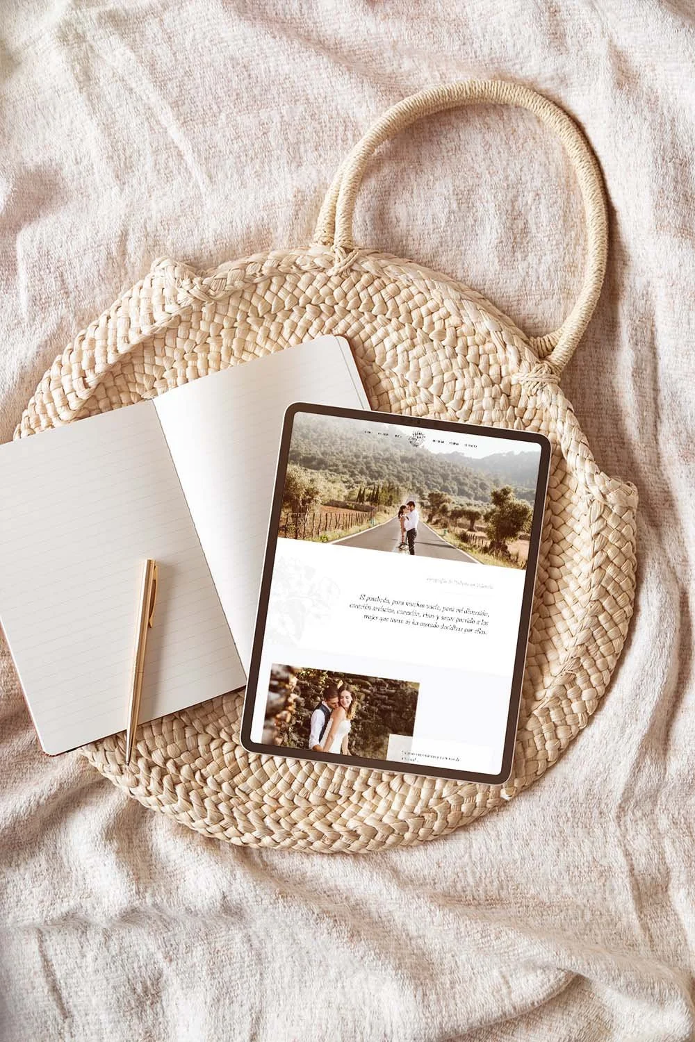
Click on the images to see full screenshots of some of the pages:


Once the mockups were finalized (and revised), it was time to build the site on Squarespace. This required switching templates and installing one from the Brine template family, since the one the site originally used was very limited. This part of the work also involved creating each page and making all necessary adjustments (including CSS code) so that the design matched the mockups, configuring all forms and buttons, and setting up all legal requirements to ensure the site complied with the GDPR (including the Privacy Policy text).
Just like with the mockups, the implementation phase of the web design on Squarespace also includes several rounds of revisions to go over all the details and ensure that Dani is happy with the result. To wrap up the project, I always schedule a one-hour video call with the client, during which they can ask any questions they may have about managing their website, making certain changes, etc. I also offer two weeks of priority email support once the work is complete.