What Is a Brand Board and What Is It For?


A Brand Bard will help you maintain visual consistency in your branding… and ask any designer: of all the elements of branding, consistency is the most important. Why? Because consistency is what will help you build brand recognition, make a lasting impression on your audience more quickly and effectively, and ensure that your audience can identify you at a glance.
On the other hand, visual branding is much more than just a logo; it encompasses all the graphic elements that identify a brand. The logo is very important, yes, but so are the fonts, colors, image style, and so on.
Consistency in the use of all these elements is the key to powerful branding.
There’s no point in having a beautiful, strategically designed visual identity if you then use the graphic elements inconsistently, or change the fonts, colors, or graphic style. When you do this, you’re basically throwing your branding—and, with it, the money or time you invested in creating it—out the window.
That said, let’s take a look at what a Brand Board is and how it can help you maintain consistency in your visual branding to boost your brand’s visibility and effectiveness.
What is a Brand Board?
First, let’s clarify the difference between a mood board and a brand board because, although both play an important role in designing a brand’s visual identity, they are two different things.
The first step in creating a cohesive brand identity is to start with a good mood board. Not only is it the first step, but it’s also the most fun part (at least for me) because it draws most heavily on the inspiration and vibe you want to create for your brand. This is where you’ll define the typographic, graphic, and color styles that you’ll generally follow when developing the other elements of the brand. In this post, I explain in detail how to create a good mood board, so check it out if you want to learn more.
Now, if the mood board is the first step, the brand board is the last: once all the brand’s graphic elements have been created, the final step is to create a brand board—or, as it’s also called in Spanish, a style guide. The Brand Board is a general guide to your brand’s visual style. It’s a reference document that should be concise and show, at a glance, all the graphic elements that make up the visual identity. Precisely because of its concise and visual nature, it becomes an extremely useful document when it comes to maintaining visual consistency across all the marketing materials you create for your business.
The Importance of Having a Brand Board (or Style Guide)
When I talk about marketing materials, I'm referring to all the visual content you create:
your website design,
business cards and other stationery,
PDF guides on opt-ins,
graphics for Pinterest or Instagram,
social media platforms such as Facebook,
webinar presentations,
and any other marketing materials you create.
Can't remember the name of your brand's accent font? Check your Brand Board. Not sure which exact color to use for backgrounds? Check your Brand Board. Editing the photos you took and not sure if the filter style you want to use is right for your brand? You know the drill… compare them to your Brand Board!
In addition, if you work with a web designer to create your site, the Brand Board will serve as an important reference, enabling them to create a design that is truly consistent with the rest of your brand’s visual style, so that your website feels fully integrated into your visual identity.
By having a Brand Board or Style Guide as a visual reference, you ensure that your graphic elements are used consistently. And, as I mentioned at the beginning of this post, consistency in the use of the main logo and its variations, colors, patterns and textures, and photographic style is what will ensure that you can build brand recognition; in other words, that you create memorable visual branding that can be identified at a glance.
Think about it for a moment: all the brands you instantly recognize and admire use their branding consistently—always the same colors, fonts, photographic style, and so on—and this is no coincidence.
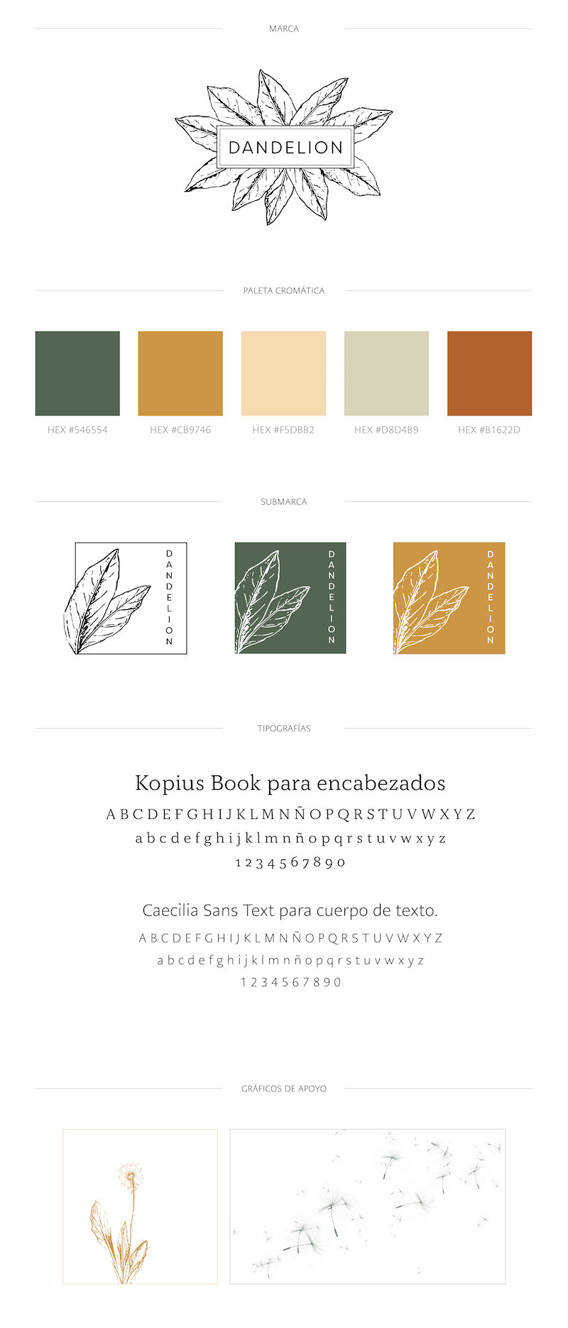
What should a Brand Board include?
As I mentioned earlier, a Brand Board should be a concise, visual document that showcases a brand’s key graphic elements at a glance. It shouldn’t be as general as a mood board, nor as detailed as a brand identity manual, which is a multi-page guide.
1. Size or format of the Brand Board
Formats may vary, but there are certain elements you should include in your Brand Board to make it effective. Personal preferences and the specific purposes for which the Brand Board will be used play a significant role here.
For example, the content you create to use as a reference in your day-to-day work with your brand is different from the content you create to share on Pinterest or Instagram and build brand awareness. Brand Boards are especially popular on Pinterest, and they can generate significant visibility for your brand.
So, when choosing a format for your Brand Board, consider how you’ll use it. Is it for sharing on social media or posting on your blog? Is it for daily use as a visual reference for the communication materials you create for your brand? Is it to give to someone else (an assistant or a designer) so they can understand your brand’s core visual guidelines? Depending on the use, you’ll determine the format and the number of elements to include.
However, in any case, the Brand Board should be a single-page document (longer or shorter) so that all the brand visuals can be seen at a glance.
2. Your brand’s primary identifier (logo) and its variations
When designing a brand, a primary identifier (commonly referred to as a logo) is created. As the name suggests, this is the main graphic element that will identify your brand. However, in addition to the primary identifier, one or two variants are usually designed: if the main logo is in a vertical format, the variant will be in a horizontal format, and vice versa. This ensures that the brand identifier appears consistently and legibly across all spaces and formats.
You can also design a monogram version for situations where there isn't enough space to include the logo, such as for use in your Pinterest or Instagram profile picture.

3. Subbrands
A sub-brand is a secondary identifier for your brand that you’ll use in place of the main logo. It should be closely aligned with the graphic elements of your brand’s design, but it doesn’t necessarily have to be a variation of the main logo.
The sub-logo is used as a way to reinforce the visual identity without having to repeat the logo over and over again. For example, you can include it in the website footer, use it as a favicon, or add it as a watermark to photos.
4. Brand colors or color palette
These will be the colors that define your brand. If you don't have much experience with brand identity design, try not to choose more than two primary colors, two secondary or neutral colors, and one accent color. This will give you enough variety while keeping the palette from becoming too chaotic.
5. Fonts or typeface palette
Typography is just as important as color in a brand's graphic design, so don't overlook it.
Define three fonts: one for titles and headings, one for subtitles, and one for the body text.
If you're feeling confused and aren't sure how to combine different fonts, a surefire way to create contrast and variety is to use different styles of the same font. For example, you can use the Lato Bold font for headings, Lato Bold Italics one size smaller for subheadings, and Lato Thin for the body text. This way, you achieve both variety and harmony.
And if you want to combine different fonts but aren't sure how to do it, you can use this tool, which offers suggestions for font combinations.

6. Patterns and textures
These aren't always necessary, but they help add visual interest to your brand and are useful as backgrounds or decorative elements. Design patterns and textures that reflect your brand's style, and use them sparingly.
Including them on your Brand Board will help you keep your brand’s guidelines front and center, and prevent you from falling into the trap of creating a jumble of backgrounds that dilute your visual style.
7. Photographs
The photographs you use alongside the rest of your graphic design should be consistent with it. When viewed alongside the other graphic elements of your branding, they should feel like part of the same visual system. This is why it’s advisable to include photographs in the Brand Board that illustrate the style they should have. Include photos that reflect the themes of the images you’ll use for your brand (product photography, abstract, inspirational, etc.), and that also reflect the color palette they should include, as well as the use of light and editing style.
8. Additional graphic elements
These aren't always necessary, but you can also include elements such as taglines, web icons, line styles, separators, or borders, etc., in the Brand Board.