Workflow: Brand Identity Design for Ingrid Fontana


There are some people you just click with right from the start, aren't there? And that was the case with Ingrid, who reached out to me a few months ago asking for help with her business's branding. She specializes in helping small business owners with their digital marketing in a simple, stress-free way.
As she told me, her business had grown recently, and she felt she needed a more professional image—one that was better aligned with the services she offers and with her vision for the future of her business… something she didn’t think she could achieve on her own through a DIY approach.
One of the things she told me in our first emails was that she felt she didn’t have a brand, but that she needed one. In reality, Ingrid did have a brand; what she lacked was a visual identity to communicate all the values of her business and better connect with her audience (in another post , I explained the difference between having a brand, a visual identity, and a logo). So after taking care of the preliminary matters (agreeing on the budget, signing the contract, and creating a project in Asana to manage the entire workflow), we got to work.
Sometimes we might think—especially when we’re just starting out—that a branding or visual identity design can be done in “a flash”; that it’s just a matter of sitting down with some software, pulling a cool, eye-catching logo out of thin air, and that’s it.
But creating an identity that truly serves as a visual reflection of a brand—one that embodies its values and attracts the right customers—isn’t something that happens overnight, nor can a logo be conjured up out of thin air. That’s why I break down all my clients’ design projects into several stages, to ensure that all the pieces fit together seamlessly and the final result makes sense.
1. The exploratory phase: defining the brand
Every branding project is a process, and my clients’ projects always begin with a Brand Questionnaire that they must complete. This helps me gain a detailed understanding of their brand, its history, its brand values, its competition, its ideal customer, and its future vision for the business. I also like to learn about the client’s personal preferences, because I believe these should also be taken into account when designing a proposal.
I always review this questionnaire on my own first, taking notes on any questions or comments that come to mind, and then I go over it from start to finish during a video call with the client. This way, I ensure that I truly understand their brand, their business, and what they want (and need) to achieve with their new visual identity in order to meet their goals.
In addition, clients often aren’t entirely clear on certain aspects of their own business and strategy (which is completely normal if they haven’t been running their business for very long), and an outside perspective can usually shed more light on certain aspects of the brand strategy. So this joint review of the Brand Questionnaire serves a dual purpose: to help me fully understand my client’s brand, and as a form of brand strategy consulting.
In Ingrid’s case, we used the call to refine several aspects of her business strategy and target audiences, which later helped us make better decisions regarding the design of her brand identity. It’s very important to always keep in mind during the decision-making process that design serves as a bridge between your business and your audience, so you need to consider what will best strengthen that relationship.
The survey yielded a lot of interesting information, but the key point was:
Since its audience was neither exclusively female nor male, it was important that the brand’s visual identity not alienate either of these two groups.
Given the nature of their service (online marketing management for entrepreneurs) and their unique selling point (making life easier for their clients), their brand image needed to convey trust and approachability, as well as efficiency and organization.
In summary, her brand values were: Efficient, Innovative, Methodical, Strategic.
Once we have clearly defined the brand’s foundation, we move on to the creative phase, where we’ll translate all this conceptual and abstract information into visual language.
2. The creative phase: visual inspiration and branding design
The Mood Board
Based on the information we gathered in the previous phase, Ingrid and I started pinning content to a shared board on Pinterest. One of the tricks for finding relevant images is to look for images that visually represent the concepts or keywords identified in the questionnaire as representative of the brand.
Based on what we had seen, I knew we needed graphic elements that conveyed efficiency and order, but also warmth and approachability, because both of these (seemingly contradictory) qualities are part of Ingrid’s service: efficiency and order presented in a simple and approachable way, thanks to Ingrid’s own personality. Furthermore, Ingrid has a very vibrant personality, and since this is a personal brand, it was important to let a little of that spark shine through in the overall branding as well.
As we searched for inspiration, we gradually turned to:
A mix of blue and yellow, with white and gray accents, and black details.
Bright and cheerful images.
Sans-serif fonts, with clean, straight lines.
Photos of office supplies that help keep things organized at work (such as markers, pens, folders, planners, notebooks, etc.).
Many geometric elements, straight lines, and mosaics.

The initial color palette proposal featured blue and yellow as the primary colors, in vibrant yet not overly saturated shades, balanced with a good amount of gray and black as neutral tones, and accented with a crimson red.
The latter, in particular, really caught my attention because they could work very well for Ingrid’s concept: she’s in charge of coordinating all aspects of her clients’ digital marketing to create a cohesive and effective strategy. Similarly, triangles and hexagons (which are themselves formed by three joined triangles) are highly efficient geometric shapes, and when joined together, they form more complex structures (such as honeycombs).
For their part, blue and yellow perfectly captured the two aspects of the brand we wanted to convey: order and efficiency on the one hand, and warmth and approachability on the other. And by incorporating plenty of white space, gray, and black, we gave the image a cleaner, simpler, and more modern look.
All of these elements came together on the brand’s mood board, which took its final form as shown here.
Logo designs
One of the most important decisions when designing a visual identity and a logo is the typeface we choose. Small differences in the strokes of two very similar typefaces can have a huge impact on how a word is perceived and what it communicates. It’s a task that requires a lot of attention to detail and patience to find the typeface that best suits a project, but if you’re like me, nothing compares to the satisfaction of finding “The One.”
Before you start frantically searching through font libraries, the first step is to define exactly what specific features you’re looking for. This will help you stay focused and make the process more efficient.
In the case of Ingrid’s brand, I already knew that, in order to convey her brand’s values, we would need a typeface that met the following criteria:
A typeface with very geometric features that conveys order and efficiency.
At the same time, it should have softer, more organic, and less rigid lines that convey the warmth and approachability of Ingrid and her brand.
And it should also be sans serif, to convey simplicity and cleanliness.
With these typographic characteristics defined, and after reviewing dozens of options (and I’m not exaggerating), I presented Ingrid with several logo designs. The final typography wasn’t yet included in these designs, but they did feature some options that conveyed the personality we were looking for, making them a good starting point.

One of the fonts we really liked was Raleway, but it had one problem: since it’s a high-quality free font, it’s everywhere. Several brands with audiences similar to Ingrid’s are already using it, and we wanted to find something a little more distinctive.
So, from the various proposals, we chose one to develop further, focusing first on finding the ideal typeface and then on determining how to incorporate the graphic elements.
Although the fonts we looked at initially (all of which were free) weren't bad, they still weren't quite what I was looking for for the brand, so I kept experimenting, this time incorporating some paid fonts.
After several tests and file exchanges with Igrid, the choice fell on Museo Sans: a very geometric and efficient sans-serif typeface, yet one that also has a friendly and approachable feel.
It had everything we were looking for:
It conveyed what we wanted.
Although it wasn't free, it was reasonably priced (we had another option we really liked, but the cost of purchasing it was too high)
And since it was a paid service, it wasn't overused, so we were able to achieve that distinctive element.

Here you can see the difference between one of the initial fonts—in this case, Heebo (left)—and the font we ultimately chose, Museo Sans (right). As you can see, Museo Sans looks much cleaner, has a better finish, and gives the overall image a much more professional look.
To wrap up the logo design process, we explored how to incorporate graphic elements. I presented Ingrid with several options and combinations of graphics, all of which used the hexagon as a central element. The version she ultimately chose is the one shown below, featuring lines in her brand’s various colors that suggest a hexagon.

Final logo, featuring the Museo Sans typeface and lines that form a hexagon in the brand colors.
The other elements of branding

The brand’s key visual elements are presented in the Brand Board, or style guide. This file, which can be in JPG or PDF format (or both), provides an at-a-glance overview of the brand’s overall visual style, and it’s very useful to always have it on hand as a guide to ensure consistency in everything we design going forward.
After completing the typographic design and selecting the logo graphic, I moved on to developing the other branding elements. This part is also very important, because having a good variety of visual elements is what allows for versatile branding and enables you to introduce variations in the designs without losing consistency. The result of working this way is a much more comprehensive and professional visual identity.
These elements were:
A horizontal version of the logo.
Various sub-brands to be used as favicons, logos, etc.
The complete typeface palette, which is included in the Brand Identity Manual.
Set the style for the icons.
And several patterns that use hexagons (and the triangles that make them up) as a starting point.
3. The production phase: part design and file delivery
Design of marketing materials and graphics for social media
Once the client has approved all the graphic elements of the branding, we move on to the final phase: designing the printed and digital marketing materials.
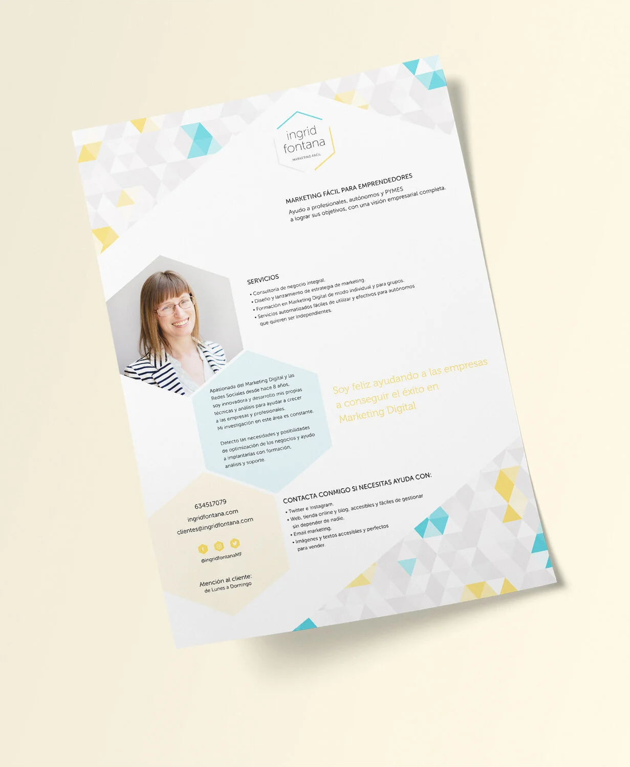
In Ingrid's case, she chose a flyer about her services, a business card, and a weekly planner that she could print out to organize her own content or give to her clients:


File delivery
After reviewing the collateral designs and finalizing the last details, all that remains is to deliver all the files to the client to wrap up the project.
I am currently exporting the logo and all other brand graphics to a shared folder on Google Drive in various formats and sizes. In addition, I am also including:
The Mood Board
The Brand Board
Editable Photoshop and Illustrator files containing the publication templates and the original logo files.
And the Brand Identity Guide, which is a PDF where I explain in detail how to use all these graphic elements, what not to do, how to maintain consistency with the branding, the brand’s different color codes, etc.—all customized for each specific brand.
Of course, even though the project ends with the delivery of these files, I’m always available to my clients, because there are often last-minute adjustments that need to be made, or to help with any questions that may come up along the way.
* * *
Finally, I wanted to tell you that Ingrid initially contacted me about having me design her branding and website. Although she ultimately hired me just for the branding, she was delighted with Squarespace (the website platform I use and recommend). She moved her old website to Squarespace herself and is building it from scratch, something that’s largely possible thanks to how user-friendly the platform is—especially if you already have a well-defined visual identity.