Free stock photos: where to find them and how to choose the right ones

As I’ve explained, photography is a crucial element of your branding. High-quality photography can elevate the design of a website, a guide, or any other visual product, and it’s essential for conveying the essence of your brand on social media platforms like Instagram.
Ideally, photos should be custom-made, but expecting that to always be the case is simply unrealistic for most businesses. Even if you have the time and skills to take them yourself, or the budget to hire a professional, there may be times when you need to use a free photo to get out of a tight spot.
Fortunately, there are many free stock photo sites where you can download photos to use in your visual communications... though, unfortunately, it’s not always easy to find the perfect image.
That’s why today I want to give you some tips to keep in mind the next time you’re looking for a photo, so you can choose one based on what best fits your brand—not just because you think it’s pretty.
where to find free photos
I don't intend to provide an exhaustive list here, but I do want to give you a general idea of what I consider to be the best places to start looking, in case you're not familiar with them.
But before I tell you where you can find free photos, it’s important to make one thing clear: you can’t just use any photo you see online and like on your blog, social media, or anywhere else, really. Always use images downloaded from stock photo sites that offer royalty-free photos, and always read the license terms they provide. There are some where you can do whatever you want with the photos, but others don’t allow you to modify them, or require you to credit the author, or prohibit commercial use... in short, every case is unique, and it’s important to do your research before using a photo.
That said, here’s a list of the seven sites that I think have the best selection of images:
Once you've found the stock photo sites you like best, the hardest part begins: finding the perfect photo for your brand or for the specific message you want to convey.
How to Choose the Right Photos
Although these websites are full of beautiful photos, just because they’re pretty doesn’t mean they’ll align with your brand. You need a photo that, when paired with your colors, fonts, and overall brand tone, doesn’t clash but instead complements them.
That's why the first thing you need to find the perfect photo is patience. You might find something that works for you right away, but often you have to spend a little time to get it just right.
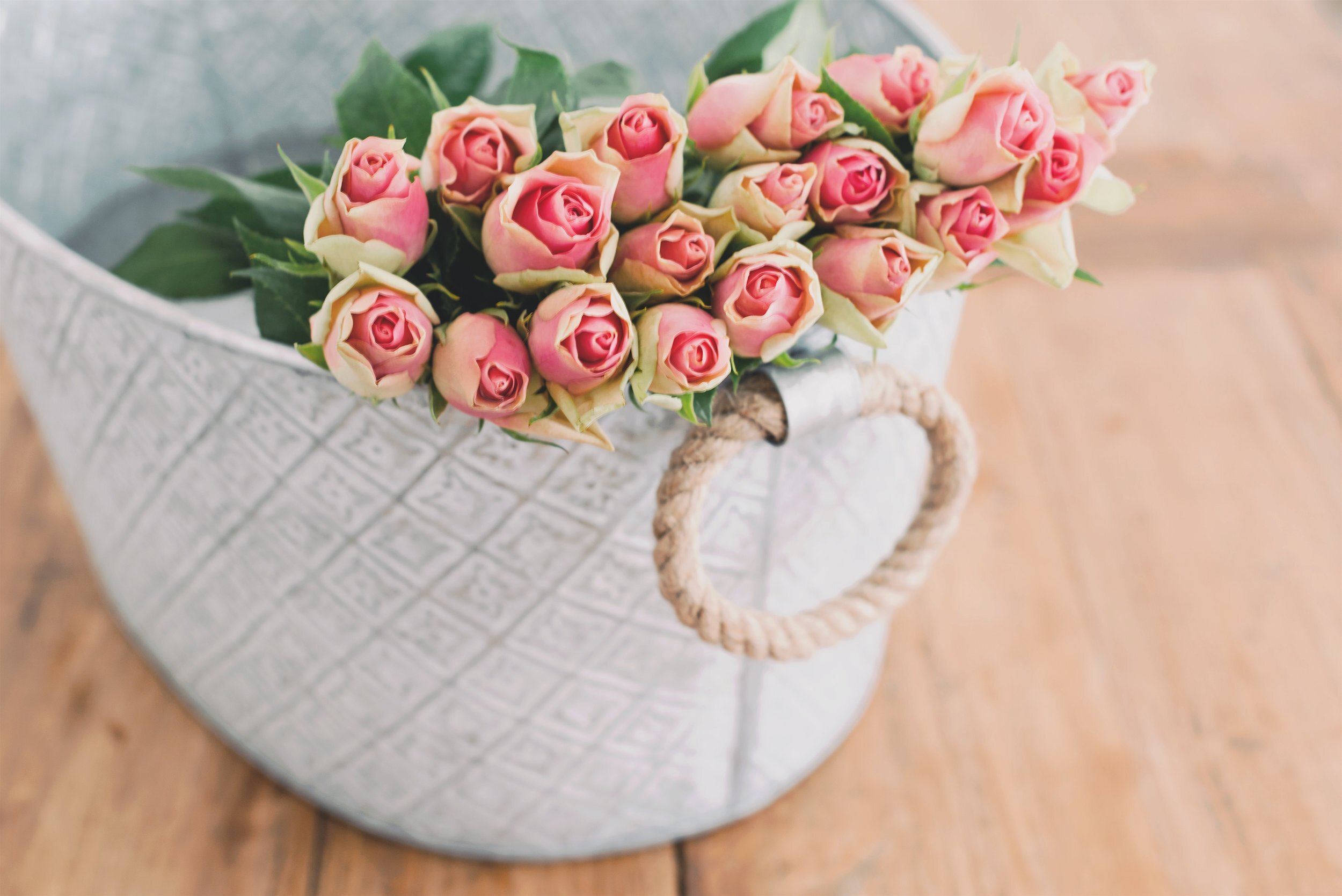
For example, in the photography I use as part of my brand, my style is bright and minimalist, with lots of white and a bold pop of color. There are colors I generally try to avoid, like pink—especially if it’s pastel. And there are others I try to use frequently, such as various shades of orange, turquoise, and yellow. Additionally, my photos for blog covers always leave space for text. When you add up all these details, getting a photo that looks consistent with my brand and the photography style I use isn’t easy… but it’s not impossible either.
Now, once you've identified the banks and set aside some time to do your research, here's what you should keep in mind:
Where are you going to use the photo?
The first thing you need to consider is exactly what you want the photo for. A photo for a Facebook ad is different from one for a website banner, which is different from one for the cover of an e-book. Depending on how you plan to use it, you’ll need a photo with a higher or lower resolution, and the orientation (portrait or landscape) will also depend on that. For example, a photo for a Facebook ad should be landscape and doesn’t need to have a high resolution, because it will appear relatively small. The advantage of this is that if the perfect photo is in portrait orientation, you might be able to use it cropped without it looking bad.
On the other hand, a photo for a full-width website banner or for the cover of an e-book (or guide, or report) will be displayed at a large size, so it needs to have high resolution and be in sharp focus.
And if, instead of using it digitally, you're thinking of using it in print, well, I don't even need to tell you... although even here, a photo on a card or postcard isn't the same as one on a promotional poster.
What kind of composition do you need?
This is closely related to the previous point because, in addition to knowing where you’re going to use the photo, you also need to know how you’re going to use it… with or without text? With a solid-color background over the image, or with the text directly on top of the photo?
Once you’ve determined this, you’ll know whether you need to include space for the copy or not. Additionally, it’s a good idea to know in advance how much text the image will need to accommodate, since the copy space can range from very large to very small. Keep in mind that copy space doesn’t necessarily have to be blank; it can also be a blurred area or one with neutral colors and textures that contrast with the text and make it legible.


On the other hand, if it’s a photo for Instagram—which usually doesn’t include any text—you don’t need to worry about that, but you should make sure the image still looks good when cropped to a square format.
What should the color palette of the photo be?
One of the elements most strongly associated with a brand—if used well and consistently—is color. Just as you need to pay close attention to color in your logo and other graphic elements, you must do the same with the photographs you use.
When designing a brand’s visual identity, you establish a specific color palette that not only determines which colors should be used frequently, but also which ones should be avoided. So when you’re looking for photos for your branding, keep your brand’s color palette in mind so that the images you choose align with it as closely as possible.
What is the tone of your branding?
But it’s not just colors that influence how well a photo aligns with your brand—the style of the image also plays a major role. Factors such as the use of light and how the photo is edited have a significant impact on how a photo feels and the mood it conveys.
When you see a photo with the right subject and colors, stop and think for a moment about what it conveys to you... Is it nostalgic or cheerful? Casual or sophisticated? Rustic, ethereal, natural, youthful...? Keep your brand’s values and character in mind, and try to ensure they’re reflected in the image.
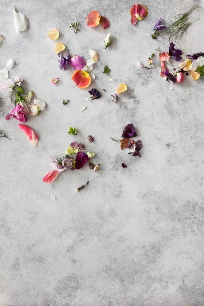
Three photos of flowers, each with different colors, lighting, and editing, convey different feelings:


What emotion do you need to convey?
This might be a bit obvious, but I think it’s worth mentioning: it’s important that the subject matter of the photos you choose aligns with your business’s theme. If you sell natural products, look for images centered around nature. Or if your brand is more about adventure, look for natural landscapes that make you want to drop your computer and run outside.
But the connection between the theme and the image doesn't always have to be literal. Remember that you're not just selling products or services— you're selling emotions, sensations, and moods. Identify the emotion you want to convey, and find a photo that matches it.


On the other hand, depending on your brand’s style, you can use photos of abstract or geometric designs, or images with large areas of bright colors… photos don’t always have to be of landscapes or flowers.
props
The props used in photos play a key role in their final look and in the character they lend to a brand. As I mentioned in this other post, using certain objects consistently can help reinforce branding. Sometimes the theme and colors match what you’re looking for, but the props have nothing to do with your brand.
Take a look at the objects and backgrounds... for example, even though I love rustic wooden surfaces, they don’t fit my brand image, so I don’t use them. In addition to rustic backgrounds, I also avoid using gold props (they convey a chic style that doesn’t align with my branding) and pinecones (they’re a very trendy element that I want to steer clear of).


Don't repeat what you've seen
My final piece of advice is to try to avoid using images you've seen on other blogs. This is one of the downsides of free stock photo sites... and that is that the same images often appear repeatedly on blogs within the same niche because they obviously fit the theme well.


There’s nothing inherently wrong with using free stock images, but if what’s on your website looks exactly like something that’s been seen countless times elsewhere, you’ll give the impression that you’re just another run-of-the-mill business—and that you don’t take your business seriously enough to find better images or invest in quality photography. And if you don’t take your project seriously, why should others?
in short
Stock photos are a great resource, and fortunately, free image banks are becoming increasingly common. But finding the perfect photo isn't always easy, and just because it's beautiful doesn't guarantee that it aligns with your brand.
If you want to improve the quality of the images you use in your business and build a more professional and polished brand image, follow the guidelines I provide in this post to choose the photos for your next photo shoot.